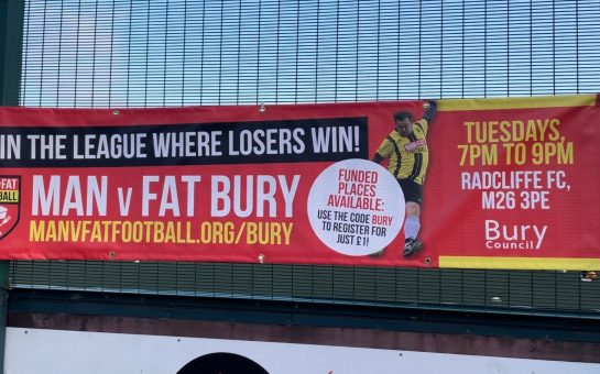
Amongst hefty transfer fees and the excitement of new signings dominating the summers of British football, what also gets a buzz going is the release of new club kits.
When Manchester City lined up against Crystal Palace the other week, it looked as though 11 ice lollies had taken to the field, in their bright yellow and pink kits.
Nonetheless, it has provided yet another classic addition to the history of memorable club jerseys that we have seen over the years and I would like to recollect some of the classics we have seen.
I feel it is necessary to distinguish what we mean by a classic shirt. You have an aesthetically pleasing and smart jersey, one that might provoke memories of past success.
One that springs to mind in this category is the predominantly yellow with blue shirt that Charlie George wore when netting that famous goal for Arsenal at Wembley against Liverpool in 1971.
In a similar way, the English shirt of the 1982 World Cup has to be regarded as a classic shirt. With the red and blue pattern on the shoulders and then a sole England emblem surrounded by white, this is an example of how a simple pattern remains fond in the memory.
You could also argue that the sponsor on the shirt makes for an immediate trigger to times of success. For much of Manchester United’s dominant reign in the Premier League in the 1990’s, the logo of Sharp was present in the centre of the red jersey.
With the accompaniment of various patterns down the sleeves, these are the jerseys when imaging Andy Cole or Dwight Yorke scoring at Old Trafford. Similarly, for much of the 1980’s, Liverpool’s sponsor Crown Paints was at the centre of their kit and is synonymous with their European and domestic success in that decade.
We have seen teams go into unprecedented territory with their away colours, venturing far from their traditional club appearance. In 1993, Aston Villa played away from home in a green and black vertically striped jersey.
In the 1997/1998 season, Everton sported a kit with vertical yellow and black stripes with a hint of blue going across the top. Having scoured the internet for these colours; it seems that the days of the jerseys with the club emblem in the centre are behind us.
Arsenal made a brief return to this style between 2004 to 2006, including the commemorative burgundy shirt in the last season at Highbury. From 2000 to 2004 Liverpool kept the emblem in the middle too, but in general I feel this style is a thing of the past.
There are kits where you have to stand and applause the audacity of the designers, Chelsea’s away kit between 1994 and 1996 is one of these. With a mixture of grey, white and orange, the first player I saw when finding this shirt online was Ruud Gullit.
Could there be a more appropriate player to be sporting such an eccentric strip? What is also a clear innovation is the dissolution of the baggy shirt. Nowadays it would just not be right to watch Eden Hazard or Raheem Sterling gliding down the wing in a baggy jersey flapping about in the wind.
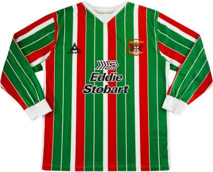
However, I would think that the majority of football fans would prefer to buy an old retro pullover than the skin-tight tops that players squeeze into these days. Retro shirts will always hold a place in a fan’s heart. I will continue with a less well-known shirt: the Carlisle United deck chair jersey. The club released an away shirt in 1993 and again in 2006, with vertical green white and red stripes all the way down the shirt.
Some shirts simply cannot be forgotten, I would say for the simple patterns which I have previously mentioned, but also for clubs entering new territory with different colours.
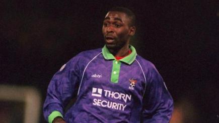
Bristol City epitomized this approach in the early 1990s. Despite having always played in red, the club released an away kit that was purple and light green.
I would like to finish on a jersey that is always in fond memory for both me and many fans of the England national team as well. It lacks all simplicity but is iconic and provokes memory of happier times in the history of English football.
At Euro 1996, David Seaman walked on to the Wembley pitch, wearing a predominantly yellow jersey with a flurry of stripes and patterns of blue, purple and green.
Others may think differently, I feel it is synonymous with his penalty save from Gary McAllister and his heroics during the championship.
Similarly, with Gullit in the Chelsea strip earlier, it is quite fitting that the moustached, stylish Seaman donned this jersey. How on earth does a kit like this pop into the heads of the designers? As we can see we have not been let down when it comes to the variety and vibrance over the years from our clubs and their gear.