The 2020/2021 Premier League season kicked off last weekend, and with it came the new crop of kits.
Shirt sales are an important part of clubs’ income – Manchester United sold over £102 million worth of merchandise last year– so teams are always coming up with fresh new kit ideas, from subtle design tweaks to outrageous third strips.
Below, we rate the top 5 best and worst football shirts in the league. For simplicity, we didn’t include goalkeeper tops (but if you’re asking, the best is Everton’s and the worst is Man United’s), and fourth kits are banned from this list.
BAD KITS
Liverpool Home and Away
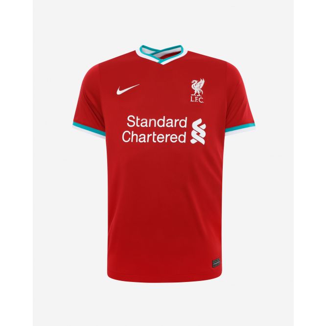
For a team that sported the best kit in the league last season, Liverpool have managed to serve up two awful kits here. The home kit, fringed with peppermint green and with a hitherto unseen “reverse collar”, is made to look good by the baffling away kit.
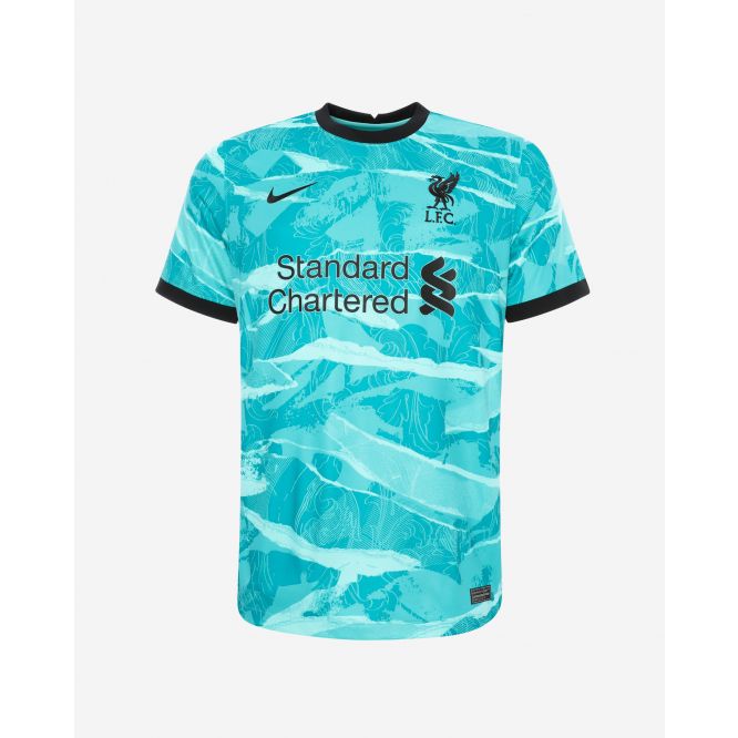
A violent shade of turquoise, the design suggests a craft project wherein a child has ripped up a load of coloured paper and stuck it back together.
Special mention to the third kit, which looks like something you could buy for a tenner from someone down the pub.
Wolves Away
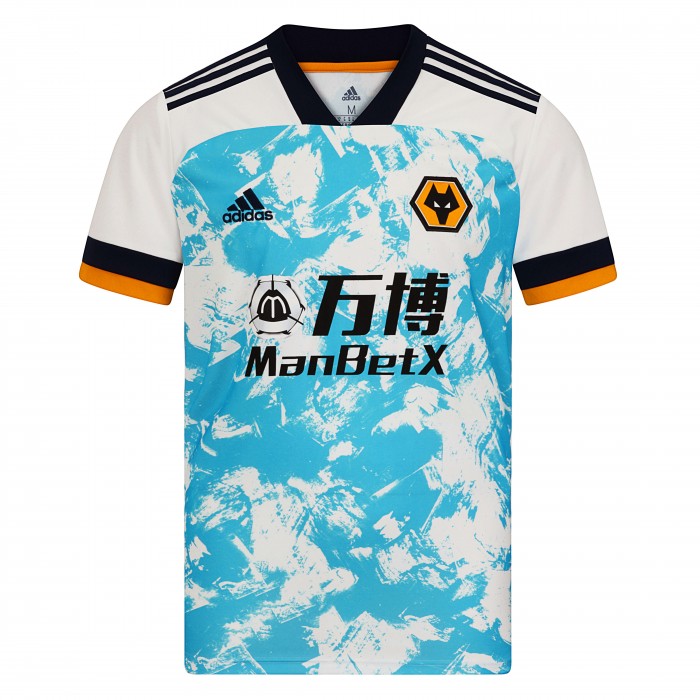
One of this season’s strangest shirts, which looks like a painting of clouds wrapped around a normal away shirt. Perhaps it’s camouflage?
Picture this: you are a defender, sliding in to make a crunching tackle on Traore. You look up to see Adama’s disembodied head and shoulders floating against the sky.
Dazzled, you miss the tackle, fail to prevent an incisive cross, and Wolves are 1-0 up. Maybe it’s not such a bad shirt after all.
Every West Brom
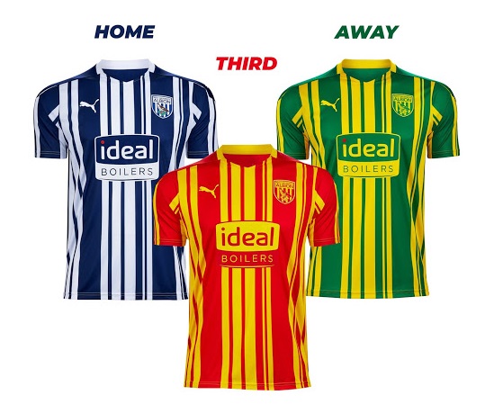
A hat-trick of terrible shirts. These combine seemingly random stripe thicknesses, contrasting sweet-shop colours, and sleeves that look like an afterthought.
West Brom may have been promoted to the big league, but these shirts looks more at home in the non-leagues.
Their official retro socks, however, are a delight.
Chelsea 3rd
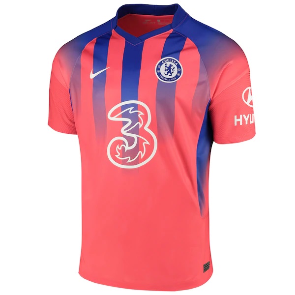
It genuinely looks as if the Chelsea hierarchy gave up halfway through designing this kit.
It’s as if the designers asked: “Do you want stripes or a solid colour?” and the reply simply came back “Yes”.
Arsenal Away
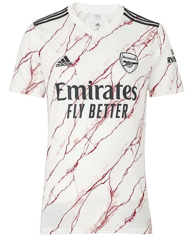
Look: you can give me the spiel about how this kit is inspired by the iconic marble walls of Highbury, and how the font is the same one used to adorn those hallowed halls- many have tried.
But all I see here is raspberry ripple ice cream and a medieval font that wouldn’t look out of place in a low-budget film about wizards.
GOOD KITS
Newcastle Home
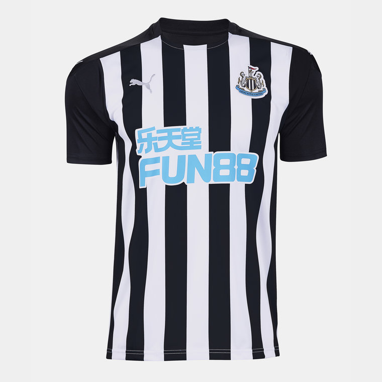
A classic example of “if it ain’t broke, don’t fix it”. Newcastle have always donned the most iconic kit in the league, and this year is no exception.
For those who grew up in the 90s, the image of Shearer banging them in week after week, clad in black and white stripes, WAS the Premier League.
If only they were still sponsored by a certain brown ale.
Tottenham Away
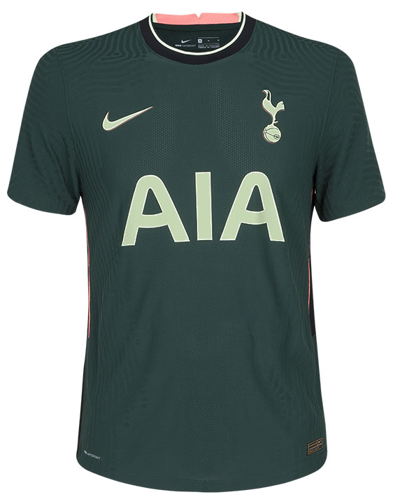
My new favourite colour is Spurs Away Kit Green.
Manchester United Third
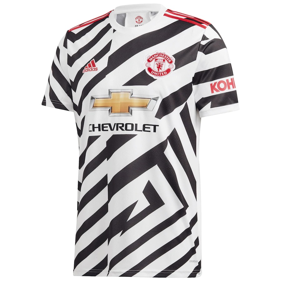
This bamboozling piece will draw the ire of many sceptics. But this is what happens when an experimental design works out.
Similar to the Kaizer Chief’s 2019/20 masterpiece, this is a bold idea that looks great.
Leeds Away
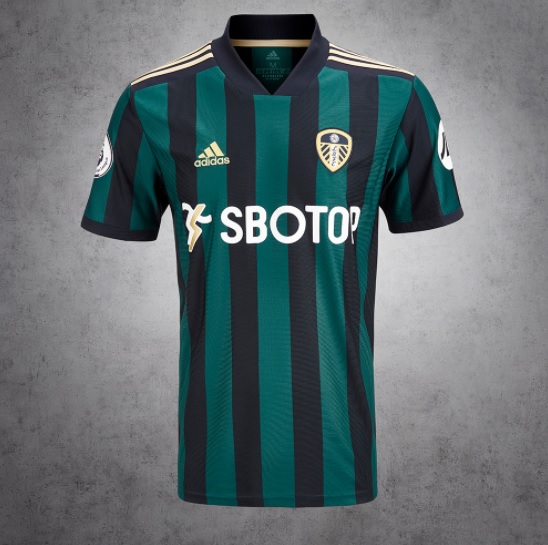
This shirt carries the air of a team that are back where they belong. The subtle, muted stripes stand in stark contrast to their kitchen-sink playing style.
But the standout here is the gold badge, which has elevated what is arguably the league’s worst crest to a thing of beauty.
If this is what Leeds are bringing to the Premier League, then they are welcome to stay.
Brighton Home
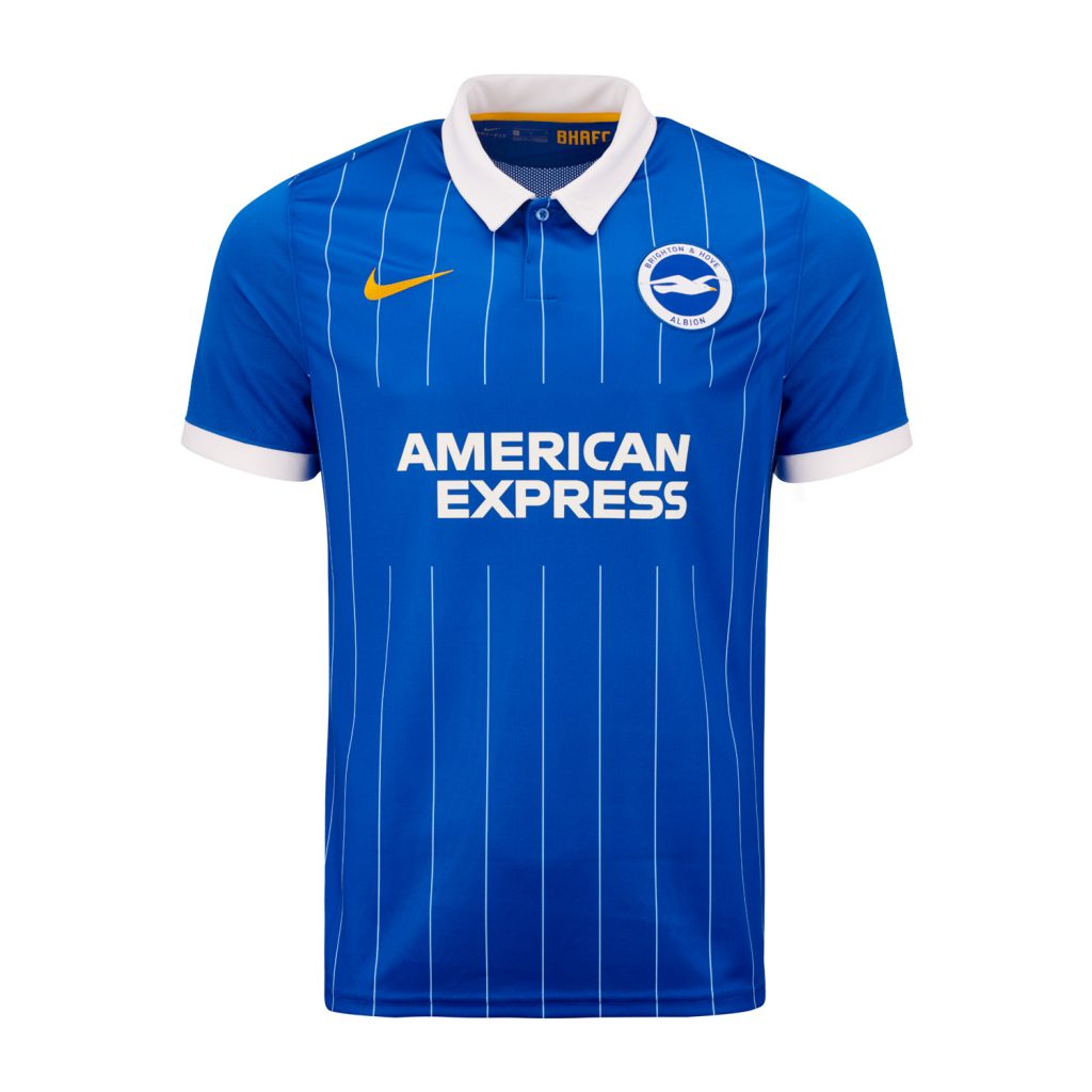
If the Premier League champion was decided solely on the kits, Brighton would blow the competition out of the water.
A classy, refined shirt that wouldn’t look out of place in the poshest cocktail bar in town.
And at £55, this is even cheaper than a Fred Perry polo. The shirt of kings.